Saturday, April 23, 2011

Uncle Sam (and superman?)


Not sure why but i stumbled upon these two political illustrations, but i really like them quite a lot. Especially the first three, theres just so much 'interaction' with the audience. HAHAH.


"Lord Kitchener Wants You" 1941
Alfred Leet


"Who's Absent?" 1915
John Bull


"Uncle Sam Wants You" James Montgomery Flagg
1916

I like how this quite serious issue is depicted by this quite humorous (and retarded) old man staring straight at the viewers, probably to exert 'pressure' on them.

But it's just so funny.
And its a good way to get its message across.


"Hope" Shepard Fairey
2008


This, I guess its just iconic, but its really good too. No eye contact, but representational stance and expression.

This isn't as humorouus as the previous ones but I guess having a close up portrait of one's face is quite a good idea to sway hearts.


This is what i tried to do. Significance of the balloons and Superman shall not be discussed yet.

Superman with "comparably" tiny balloons. Cute and gay eh?

So I was debating whether I should add words to this sketch, like will it spoil its comedic effect or add understanding for viewers?


I AM SAD I CANT DECIDE.

Wednesday, April 20, 2011

BULLETIN BOARD AND OTHERS

So, i actually bought a bulletin board early this year to put up any sort of inspiration this year. BUT, it seems that random things are starting to pile up on it. So, i decided to take pictures of them and then (probably) remove them. And refill it with other (random) stuff.


some 'inspirational' post-its.


guess who?


my sister is so smart to drop her pendant into my speaker bass.
then its a day with a really nice sunset.
and then it's chiawei's screwed up birthday cake:D

Sunday, April 3, 2011

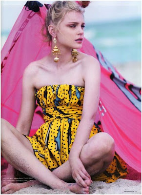
LOVE PINK AND YELLOW.

Hi, this is a really random decision to pay a 'tribute' to the colours that significantly made my life 'brighter' :D
Well, its mainly pink and yellow. Not sure why they attract me so much, but they somehow do. Pink is gonna be like the main colour in my coursework. YESHH.


And yellow? It's just so so so HAPPY. and somehow retarded cos they remind me of clowns and circuses.


On the side-note: Another reason that sparked my interest in yellow:) HAH.


Saturday, March 26, 2011

Converse.

Hi-tops are AWESOME. Especially those done by ME:)

SO, I just decided one Sunday, that I should paint my own converse. In weird but awesome colours. So, I bought them, and on Friday, yes this Friday, the Friday before BTs, I painted them:) I took it as a pre-exam relaxing activity...

And today, I was taking random photos and editing them. All these time when I should've been writing my AEP essay D: Alors, I guess it's worth all these fuss, cos' it's looking FINE now.


Anyway, I painted the with acrylic paint, added some black lace and sewed a polka-dotted ribbon on their tongues,(which was a really abrupt decision)


Ah. I should seriously start doing some academic stuff. Just spent my whole day on tennis, French and shoes. But, THE WORLD IS COMING TO AN END SOO RIGHT?!?!! IM SO GONNA SPEND TIME DOING THING I ACTUALLY ENJOY.


THANK YOU AND GOODNIGHT EVERY-BODAY!


Friday, March 25, 2011

SHIYUN'S PRESENT!

HMM. MAKING RETARDED BIRTHDAY PRESENTS ARE ADDICTING;)

So, I decided to stick with acrylic transfer again, but this time, with real (non-edited) photos and just using pen and markers to write random stuff on the canvas, mainly things pertaining to Shiyun's deep affection for Jaejoong.


I'll have to admit that my acrylic transfer is probably not up to standard. Yet. But it does give quite a nice vintage effect. (not an excuse)


Oh, and I wrote really funny (i think) things on it and so... IT JUST LOOKS SO PRETTY!!


And I added such a cute pink bow on it :Dn (scroll down)


P.S. Shiyun may just kill me if finds out I posted this on my (public) blog! HAH.


Tuesday, March 15, 2011

SHOES. again?!

Hello peeps.
Not sure why, but I had this huge urge to post something about these shoes. I know these have been 'in' for quite some time, but, well, better late than never:)


So these guys first came out when I first started researching on "combination of young and old". Seems like there are people who thing these shoes are the perfect combination of the young (sports shoes) and old(high heels)? Perhaps?

Oh well, I have the feeling that people will see these more as high-heeled shoes than sports shoes. Quite obvious right? The sneakers part just seem to be a part of its design.

I just wanna say that I'm a huge fan of this 'fusion' culture that's trending around, like this hello kitty-shaped beaded bag I saw from some branded shop recently (can't remember).

Shall try to somehow incorporate this 'combination' into my coursework, and shall research for more such 'fusion' objects.


Combination of sneakers and heels. Smart move. And on the side note, I bet they're really comfortable. ok, maybe except the last one:)

Brian Despain

While Mark Ryden made me want to do something on a really solemn subject (or at least make the theme of choice seem very grave), and add some sarcastic, dark humour to it, looking at Brian Despain’s paintings just delight me. It makes me want to do something lighthearted. This dude can even do a painting on a theme that is super insignificant or can be inspired by merely a weird conversation with a stranger. However, he does also take on serious subjects such as over pollutions in the world, but there is somehow a whimsical touch to it that makes everything not so dead-pan.


His subject matters mainly consist of robots, as part of his 100 robots project. While his painterly work retains a sense of humor, these paintings also belie a sense of melancholy, stemming from recent issues in the artists life. The robot appear to be in bleak situations and landscapes that look ready to storm. Painted in hurricane-cloud greys and blues and sulphurous post-apocalyptic yellows, the robot "protagonists" blunder their way across tumultuous landscapes, thrilled by a newly discovered concept of “self” yet haunted with the dawning realization of their fatal disconnection from the life which surrounds them. The artist stated that he wanted all 100 robots to have their own unique personality and tries to bring in their souls into the painting, through their actions since their expressions are quite fixed.


Looking at his works, one can clearly see the playful humor he presents. Unlike in Ryden’s paintings, one has to think/analyze really deep to sense his dark, often morbid humor; Despain simply includes a short, witty write-up to explain his works in an impish tone. Most of his works are based on his real-life experiences, characters being inspired by the people he knows, the themes just random ones he picked out in his sub consciousness. He taught me that although the way you paint might not bring about much thoughts from the viewers, but it sure will be memorable he can make such a serious matter seem to light-hearted.


The more I look at his works and his working style, I realize that perhaps I’m more Despain than I am Ryden. I am fine with sarcasm, a little bit of morbidity, but deep inside, I still do have the inner ‘retardedness ‘ in me. Maybe I can try to like, like give each of my subject matter a tinge of playfulness, so that it won’t look so solemn and serious… But of course the girl in the middle will still look empty in her eyes. Maybe something like these?

<------


<----- like just adding some elements of fun? like this (my favourite) toot-looking owl?


Hmm, two of my favourite pop surrealists, on the two extreme ends Ah... I’m so fickle :D